A modern-day Anthony Bourdain turned jewelry designer had thirty statement pieces of ceremonial silver and stone, and no language for any of them.
We built the mythology they were missing.A journey through mythology and initiation, told in silver talismans.

A name had to survive a Bali shoot brief and a US ad, carry a myth, and hold up in front of someone who actually knows mineralogy. So every stone got a full dossier first: mineral properties, six thousand years of trade routes and temple use, its Jungian reading and its stage in the alchemical Great Work. Only then was a name allowed near it. Every artifact ships with its real chemical formula.
Naming rule: no leading article. It's Mirror, never The Mirror.

To wear the dragon is to say: I went there. I did not kill it. I integrated it.
Two pendants use lab-grown quartz, and "synthetic" reads as fake to anyone shopping for meaning.
Same SiO₂, same hexagonal lattice, grown at roughly 400°C and 1,000 bar in a sealed chamber. This stone wasn't found by luck. It was forged. The weakest fact in the catalog became the most on-brand one.


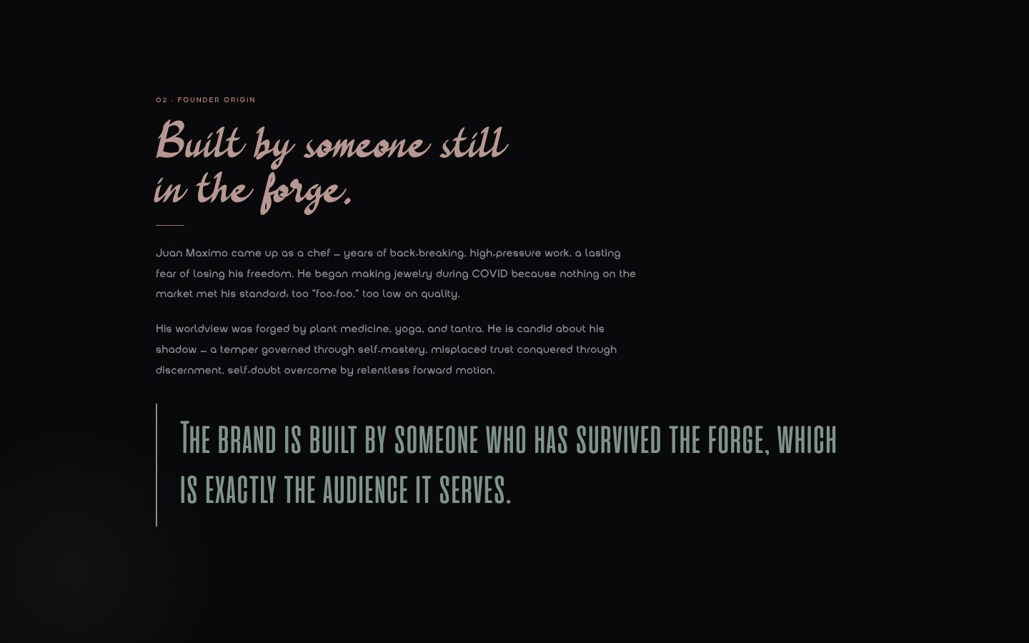
Juan came up as a chef: years of back-breaking kitchens and a lasting fear of losing his freedom. During COVID he started making rings for himself, because everything he could buy was, in his words, too foo-foo. Long on spiritual signaling, short on quality. He had no formal silversmith training. He bought the stones and made his own.
By the time he came to Broken By Design, he had a thirty-piece line and a category split into two bad options: biker silver with no soul, and love-and-light crystal shops with no spine. Without a strategy, the brand was headed for the most crowded corner of the internet.
Festival Etsy, with mood lighting.

Four recorded workshops, each locking one layer of the brand before the next could start. Strategy before voice, voice before visuals, visuals before the storefront. Then I went back through the recordings for the lines Juan said without noticing he'd said them. The best copy on this project came out of the founder's own mouth, offhand, and got fed back to him until he could hear it.
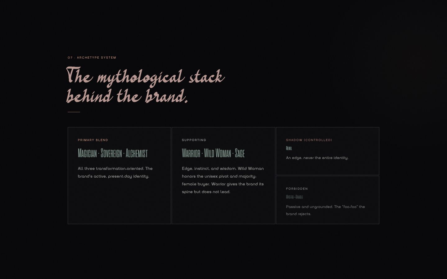
Founder mythology, archetype stack, a competitor map, cultural POV and emotional territory. Fifteen strategic deliverables.
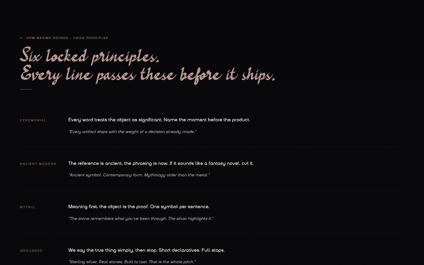
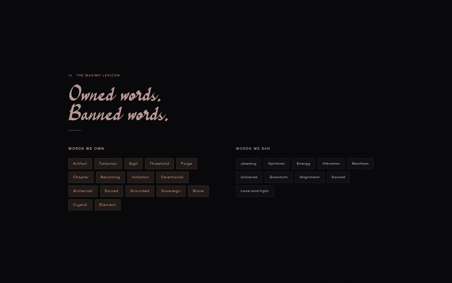
Six voice principles, the We Are / We Are Not spectrum, a lexicon of owned and banned words, the messaging ladder and the naming system.
The voice translated into image: visual principles, a casting brief, motif rules, a color-grade spec and a four-shot recipe per artifact.
Storefront architecture, product storytelling on every page, and the conversion path from first scroll to checkout.
A 26-section interactive brand book: essence to campaign system, every section traceable to a workshop decision.
A full dossier per stone (mineral history, cross-cultural myth, Jungian framing) and the naming deck built from it.

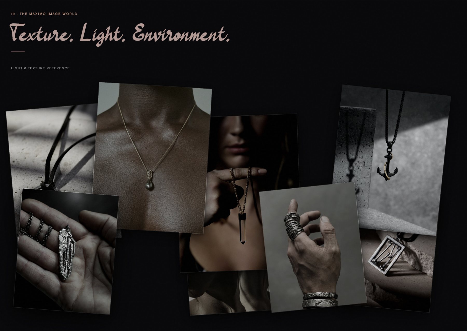
Before a single shot list, we agreed on how MAXIMO should feel in the hand and on the body. Light comes from one side. Silver shows its hammer marks and its tarnish. Skin keeps its texture. Nothing looks new, because nothing in this brand was given.
The test: the image should make you feel something before you know what you're looking at.
Workshop 01 built the brand around conscious masculinity, which was Juan's own Warrior energy. Then the Workshop 02 recording surfaced the inconvenient math: roughly 80% of jewelry spend comes from women, buying for themselves and for the men in their lives. A men's brand would have been talking past four out of five buyers.
So we rebuilt the foundation mid-flight. "Masculine" was retired brand-wide in favor of edgy, raw, bold, real. The Warrior moved from lead archetype to the founder's origin story, the Wild Woman joined the stack, and all fifteen Workshop 01 deliverables were reworked to match. One unisex brand, and no pink spin-off line.
Cheaper to fix in a workshop than in Ads Manager.

The test we wrote into the brand book: cover the logo on any sentence of MAXIMO copy and you still know whose it is. Six locked principles do the work: Ceremonial, Ancient-Modern, Mythic, Grounded, Initiated, Earned. The lexicon is the quiet moat. Products are artifacts, collections are chapters, customers are wearers, and the stamp inside every ring is a sigil.
Forged for the version of you that's coming.


Workshop 03 translated each voice principle into a visual one. Light comes from one side. Blacks get crushed, skin stays real, and silver reads textured, never chrome. The casting brief has one audition prompt: stand still, look at the lens, do not perform. The photographer's job is to wait until the model stops trying.
Symbols show up through real objects and architecture, never as overlays. A snake is a cast artifact or a shadow on stone. Sacred geometry is a real archway.
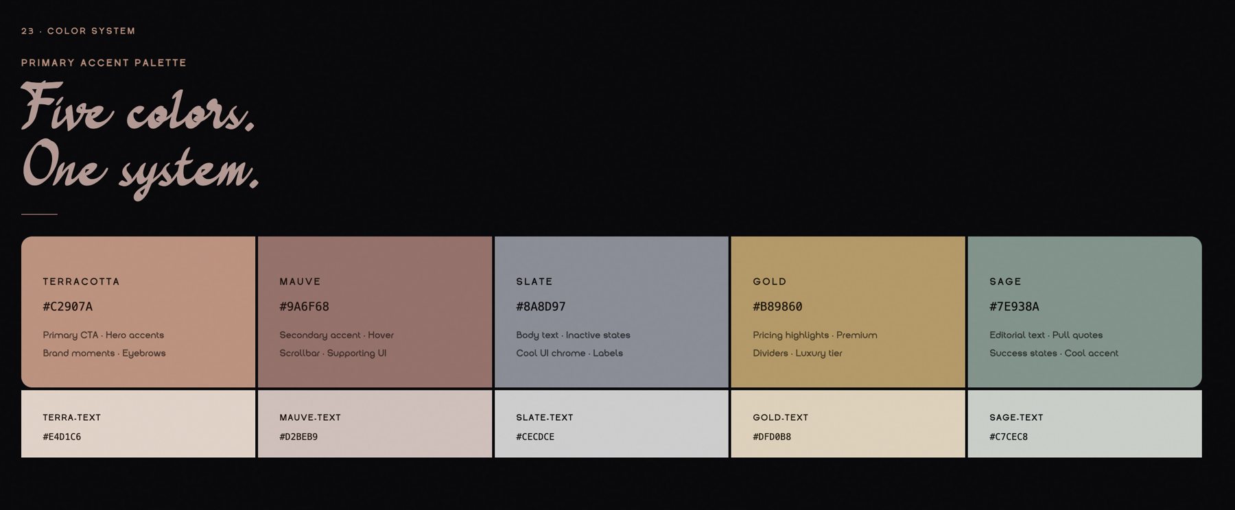
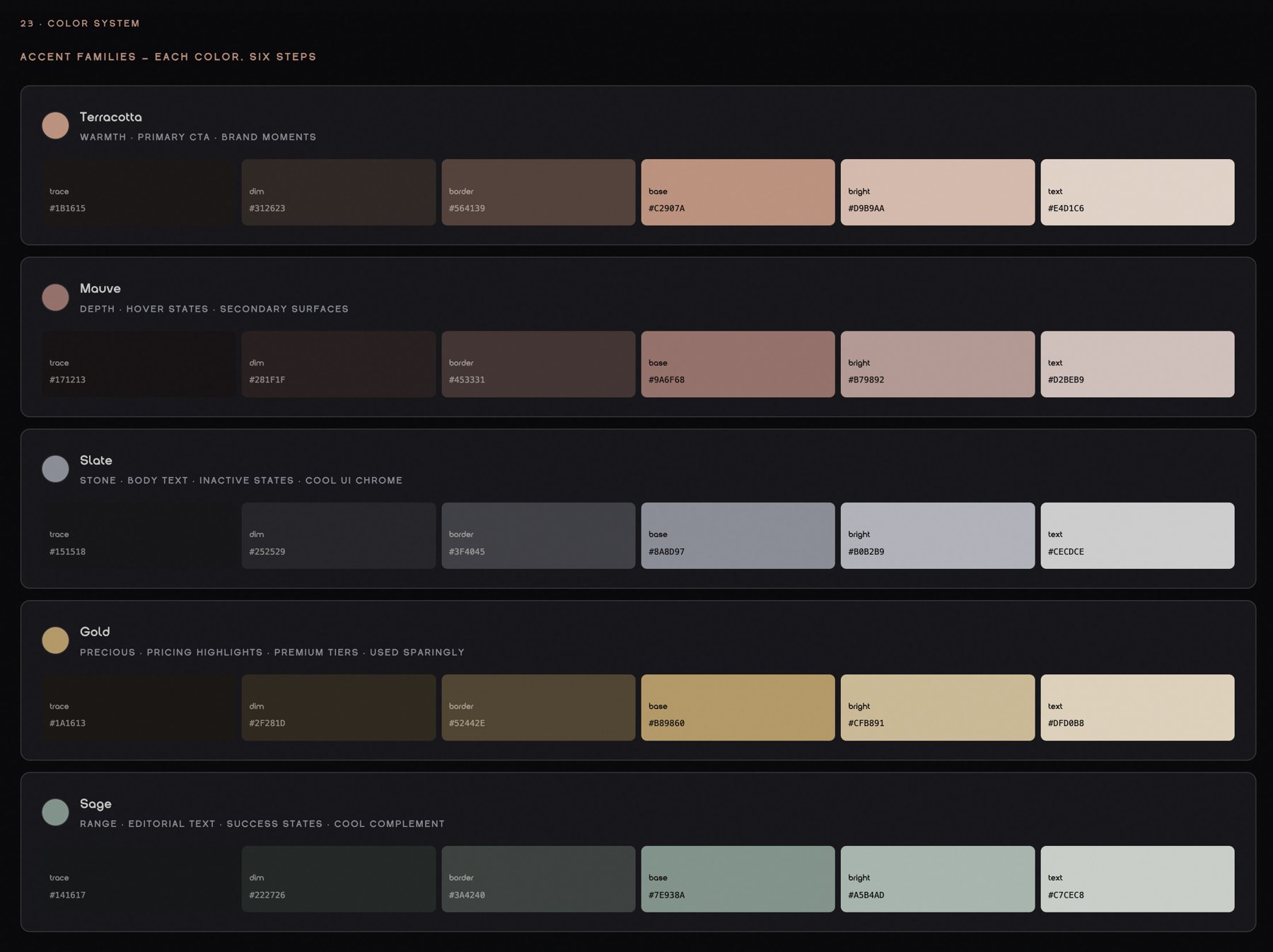
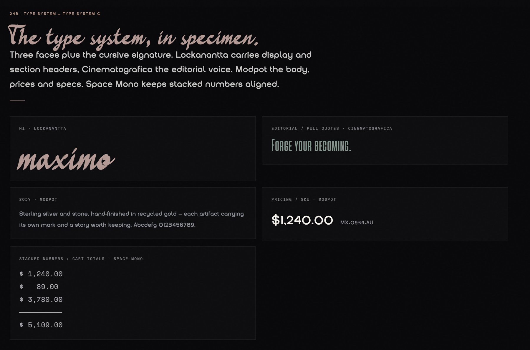
I creative-directed the full visual identity: the signature logotype, the JM insignia, the five-color palette and the type system. A contracted designer executed the files against my brief (the sigil spec, type direction and photography color requirements), and every piece answers to the same voice principles as the copy.
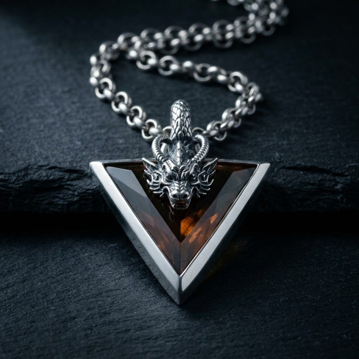
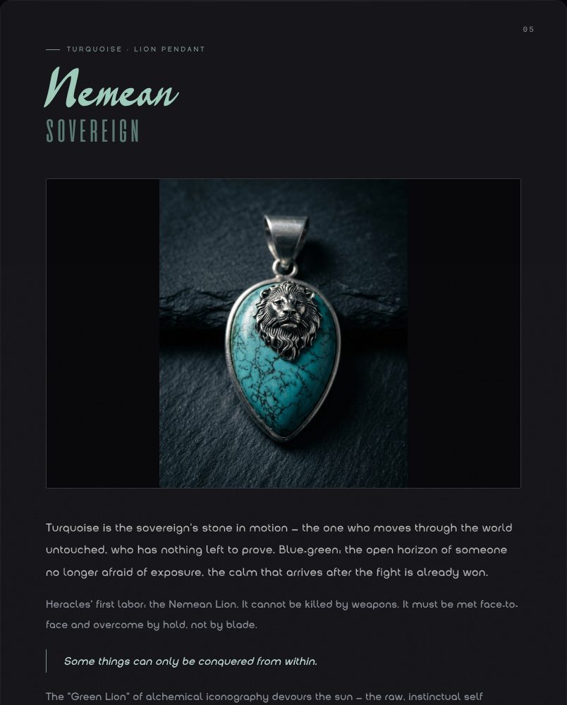
Each with its stone, formula, archetype and alchemical phase. Mirror through Witness.
Essence, positioning, archetypes, voice, lexicon, visual system and the campaign recipe.
A locked guidelines file that loads into every future session, so nothing drifts.
The method, generalized into Broken By Design's standard brand workshop process.
I dig out the story a founder is already telling and turn it into a system: positioning, voice, naming, and the art direction that carries it. We start with a paid consult.